The embroidery for the Centenary Cope was designed to belong unmistakably to the Church of Our Saviour. Rather than applying a generic decorative program, the motifs were drawn directly from the parish’s architecture, grounds, and history, then translated into embroidery that could function across silk, seams, and movement.
Every element had a role to play—some symbolic, some optical, some declarative—and together they formed a coherent visual language for the garment.
Sources From Within the Church
Several recurring features of the church served as primary inspiration:
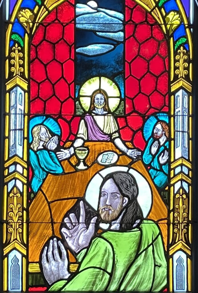
- The edifice depicted in each of the stained glass windows
- The five gold crosses that crown the rooftop
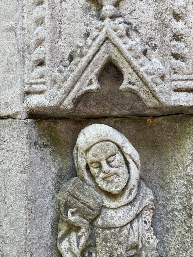
- The quatrefoil positioned above the saint in the garden
These forms were already part of the context that is Church of Our Saviour. The task was not invention, but interpretation: adapting them for embroidery that would read clearly at scale, remain legible in motion, and sit naturally within the larger design of the cope.
Flowers Mark Transition and Diversity
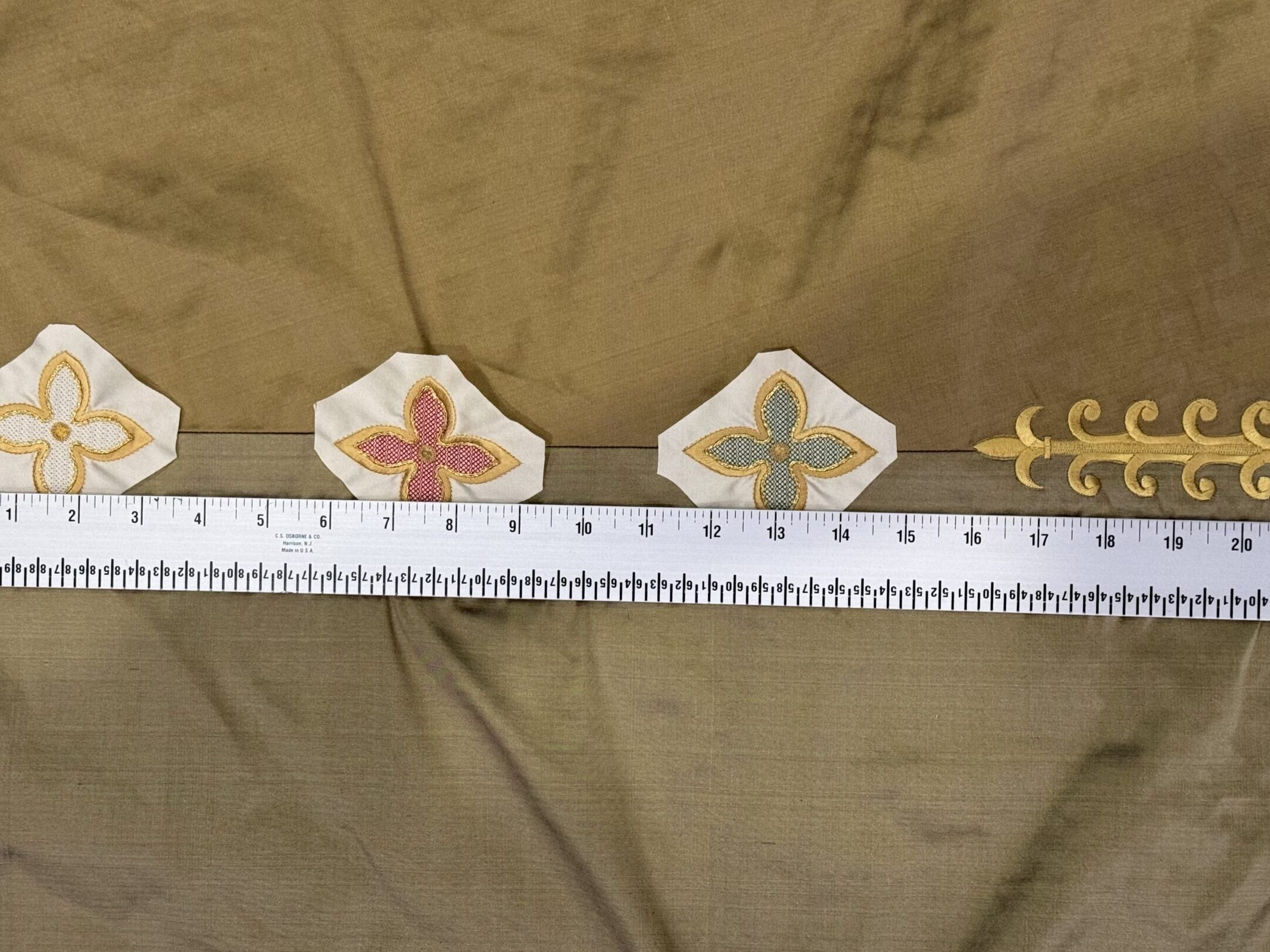
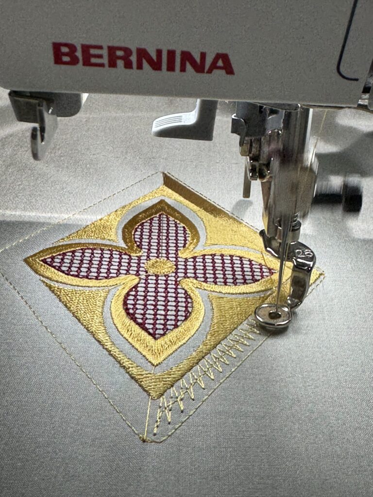
The quatrefoil was adapted into floral forms placed along the seams at the sides and back of the cope, following the edges of the triangular pattern pieces.
Because the cope is constructed from distinct silk panels—progressing from light silver through darker silver, bronze, and gold—the seams themselves risked interrupting the visual flow. The flowers were designed specifically to mediate those transitions, softening seam lines and allowing color to shift gradually across the surface of the garment.
Each flower is embroidered in a different color, representing the diversity of the parish. There are twelve flowers in total, a deliberate reference to the twelve disciples of Christ. Their placement is rhythmic rather than emphatic, encouraging continuity rather than contrast.
At the center of each flower, a gold spangle was added. These small points of light echo the gold crosses on the roofline and bring quiet animation to the seams without drawing attention away from the whole.
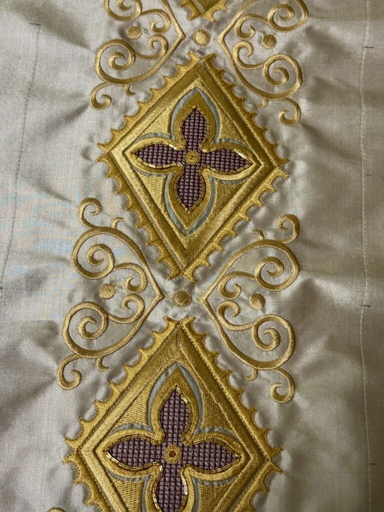
Diamonds, Gold & Scrollwork Front and Center
Down the front of the cope, the embroidery becomes more formal and declarative. Here, the quatrefoil is set within diamond-shaped frames, forming the central vertical axis of the garment.
These diamonds are combined with scrolling embroidery and couched gold threads, establishing the cope’s primary visual identity. Unlike the seam flowers, which soften and blend, the diamonds are meant to be read clearly from a distance. They provide structure, rhythm, and dignity appropriate to a processional vestment.
The contrast between these two roles—flowers that mediate and diamonds that declare—was intentional and central to the design.
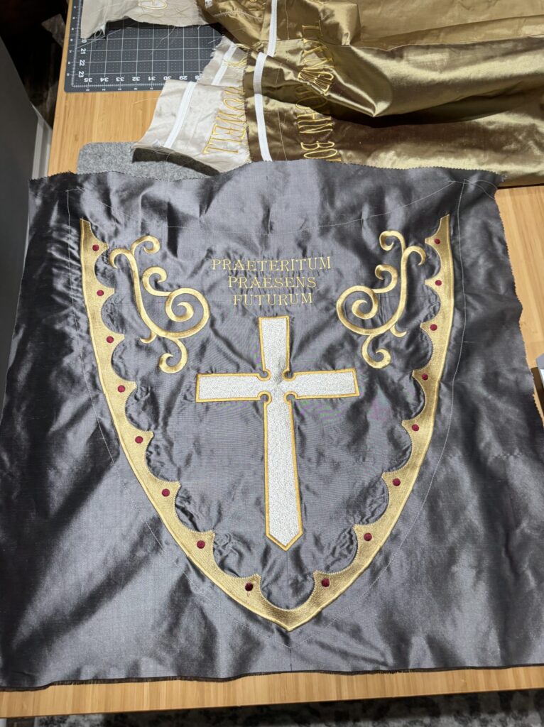
The Shield of the Cope
On the shield of the cope, the embroidery becomes explicitly identificatory. Here appear:
- The Church of Our Saviour cross
- Supporting scrollwork
- The Latin inscription:Praeteritum · Praesens · Futurum(The Past · The Present · The Future)
Placed at the heart of the cope, this phrase articulates the purpose of the centenary vestment directly. It names continuity across time—not as abstraction, but as lived experience.
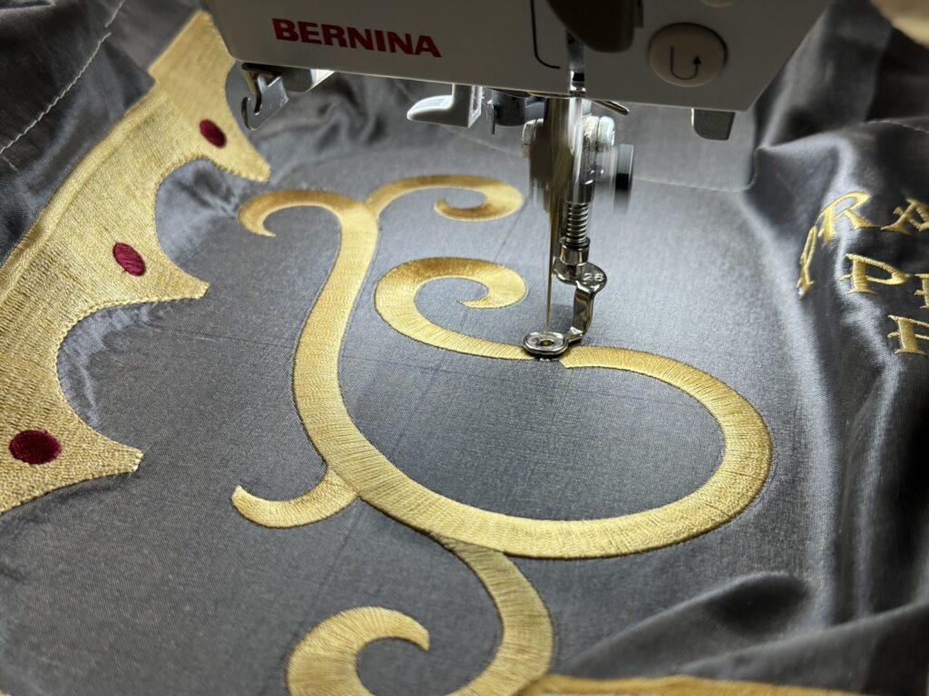
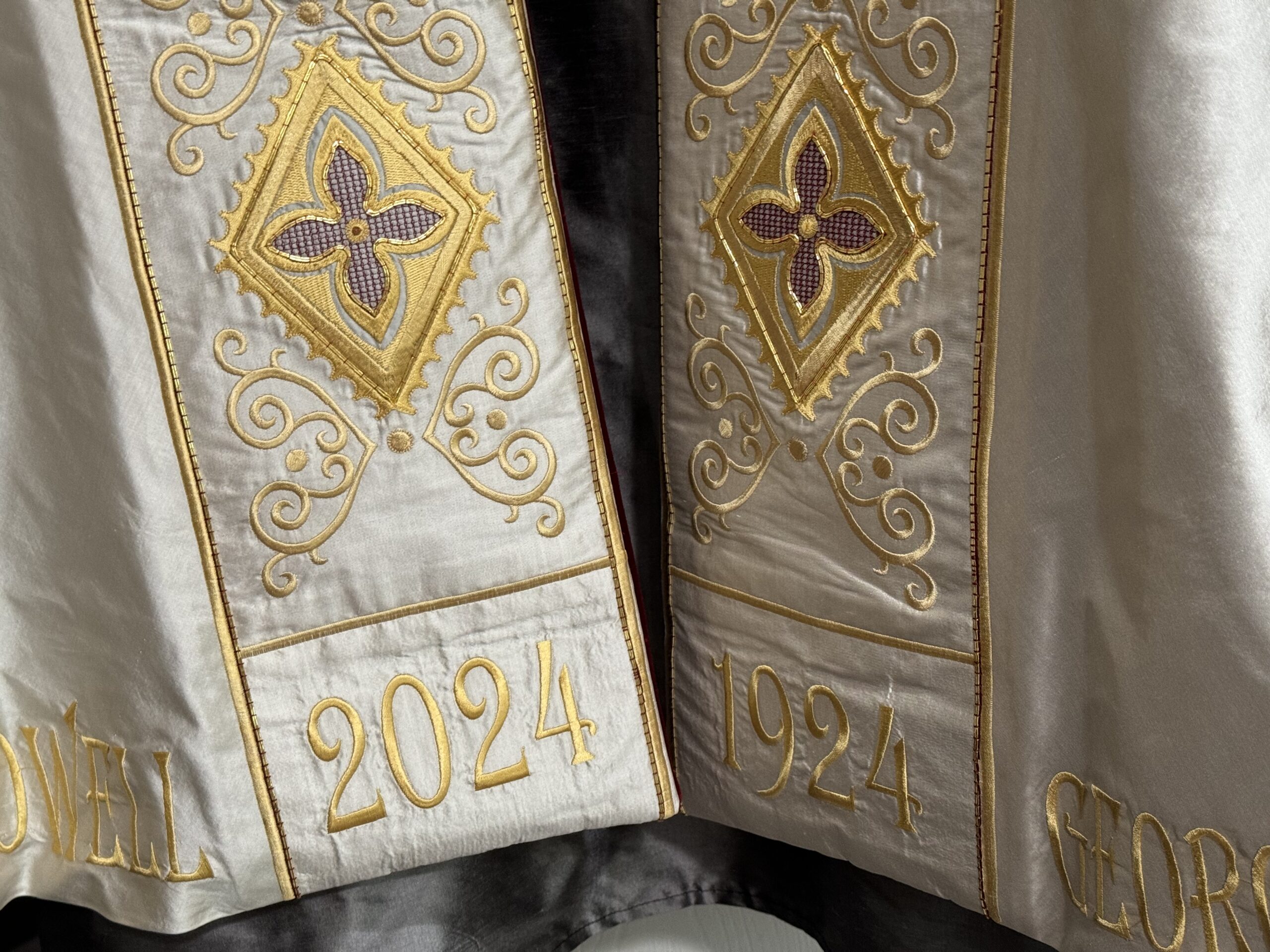
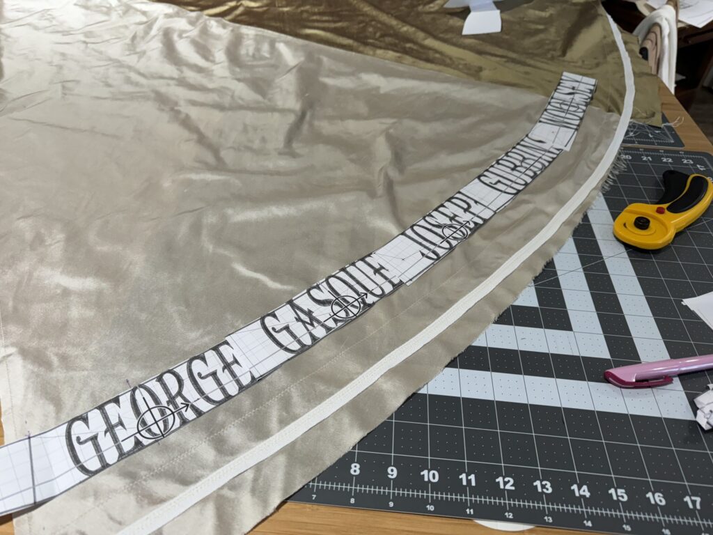
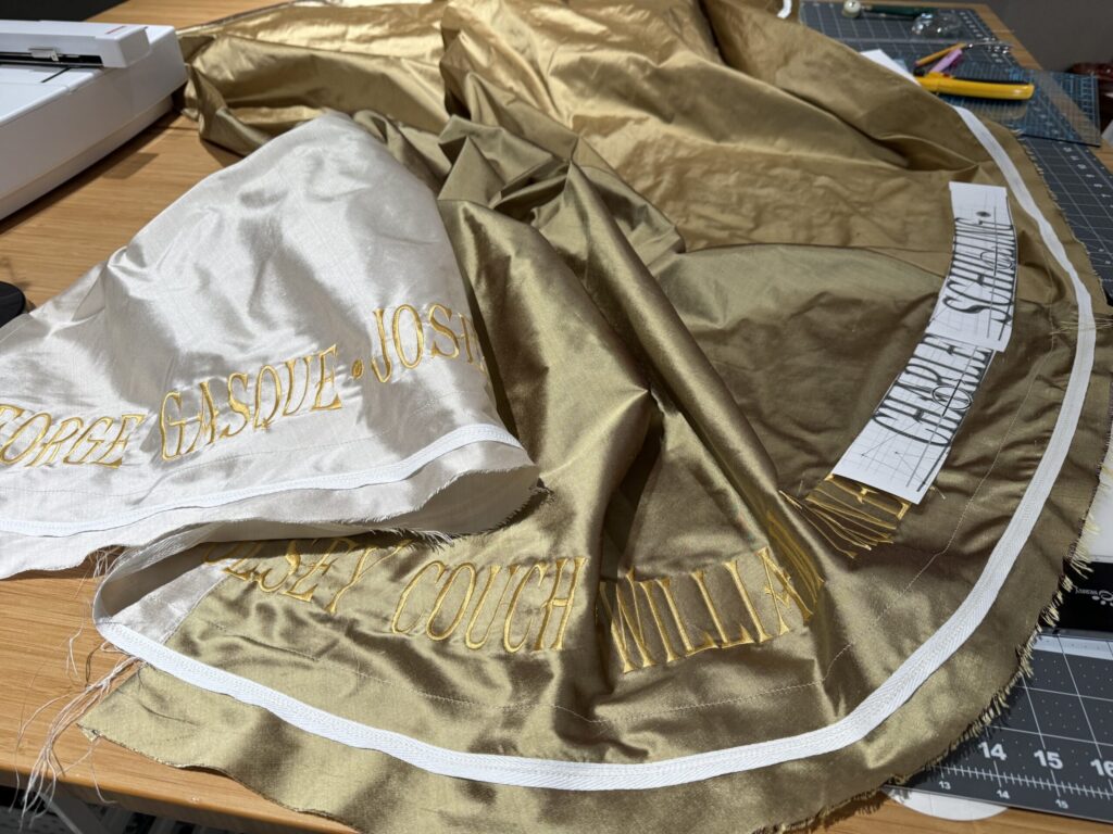
A Century of Rectors
Along the lower edge of the cope are embroidered the names of every rector who has served the parish over the past one hundred years, beginning in 1924 and continuing through 2024.
When viewed from the front, the timeline reads physically across the garment:
2024 appears at the lower edge on the left, and 1924 on the right. The names progress accordingly, starting with George Gasque and culminating with Melanie Rowell, the current rector, whose name appears beside the year 2024.
This placement situates the present within the full sweep of the parish’s history. The names are not highlighted or separated, but treated with equal visual weight along the bottom edge of the cope—an acknowledgment of shared foundation and stewardship across generations.
Designed for Shared Completion
Both the seam flowers and the front diamonds were designed to allow for parish participation. These elements were prepared and packaged into kits so that the final handwork could be completed by members of the congregation.
Participants included members of the vestry, the choir, the book club, and other parishioners who happened to drop by the office that week. Each person stitched a gold spangle into the center of a quatrefoil, contributing a small but tangible act to the finished vestment.
This work was intentionally modest in scope. The goal was not to train embroiderers, but to create a moment of shared making—many hands completing a single, unified design.
Embroidery that Belongs
Taken together, the embroidery of the Centenary Cope is inseparable from the place for which it was made. The motifs arise from the church, the people, and the history they share. They are not interchangeable, and they were never meant to be.
In the next post, I’ll focus more closely on the parish handwork itself—how these kits were prepared and why shared making matters in the life of a sacred object.